
studyspace
Increasing SUS score by 28% on personalized library space reservation
My Role: UX Designer & Researcher
Duration: 7 Days
Platform: Mobile Web
Tools: Figma
Team: Solo
📌 Context
This project is a redesign of “studyspace” — an external platform provided by UW libraries – with a goal to improve the experience of finding and reserving dedicated study spaces on mobile.
🔍 Evaluate the old design
Following the Usability Heuristics for User Interface Design, I identified some problems regarding the usability of the old design as follows:

Interview
To define user’s pain points, I interviewed 4 students from different school years, majors, and with different gender identities
“
“When I was a freshman, I didn’t know there were so many spaces to study in the libraries.”“As a female, I sometimes feel inferior walking past the computer zone, when there were too many guys.”
“I go to the library when I want a place to work, but there were times when I feel pressured sitting in a quiet room with people studying intensely.”
”
🚌 Identify the user needs through journey mapping
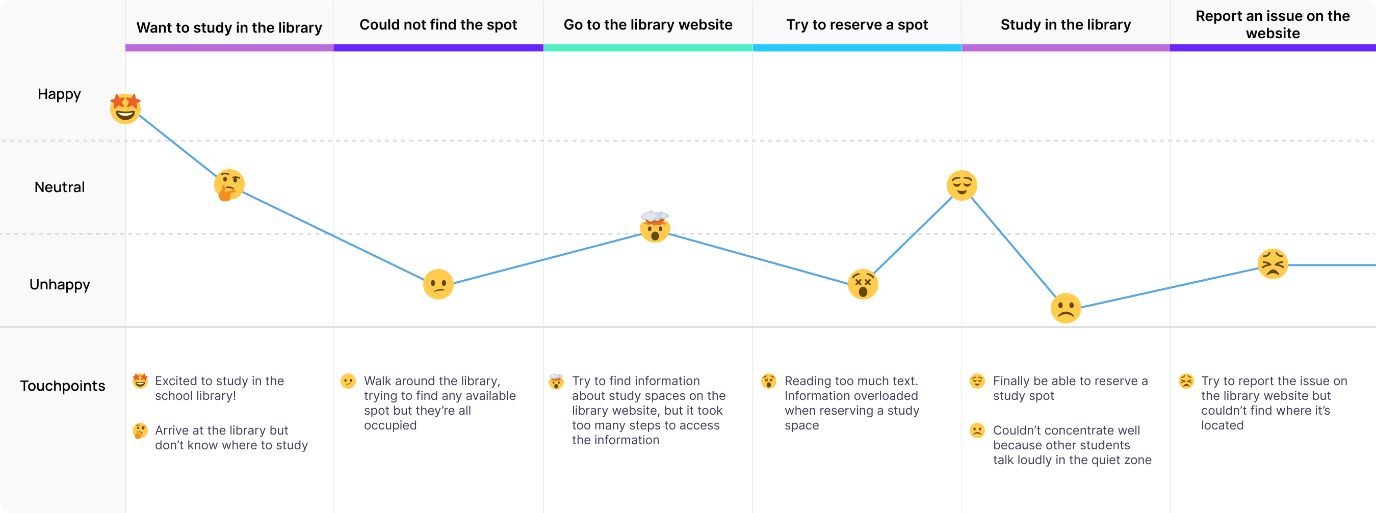
The key insights I got from the interviews are that there’s a lack of awareness about opportunities provided by the library, while some also feel pressured from the environment of the study spaces. I then used these findings to create a user journey map with the goals to identify the unmet user needs and to visualize user emotions.
✏️ Early Sketches
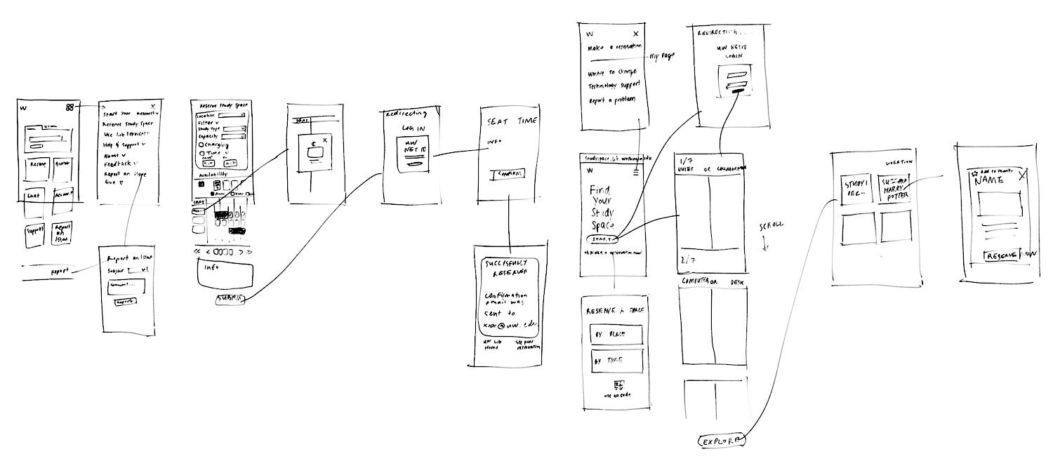
🎯 The goal was to improve the experience of finding and reserving UW library’s dedicated study spaces on mobile
User Goals
The primary user goals are to simplify the process of finding and reserving study spaces, increase awareness of the library’s offerings, and not feel pressured or discomfort by the study environment.
🧑🏫 Make it easier for library users to discover and reserve study spaces
The primary user goals are to simplify the process of finding and reserving study spaces, increase awareness of the library’s offerings, and not feel pressured or discomfort by the study environment.
Business Goals (UW Library)
Providing a more inclusive and comfortable environment will position the library as a welcoming and accessible resource for a diverse community of users.
👫 Creating a more inclusive and comfortable environment
Providing a more inclusive and comfortable environment will position the library as a welcoming and accessible resource for a diverse community of users.
Impacts
By providing a user-friendly, inclusive, and efficient library space for students and visitors, it will welcome more users and lead to a more favorable perception of the library.
🤩 More users and better perception of the library
By providing a user-friendly, inclusive, and efficient library space for students and visitors, it will welcome more users and lead to a more favorable perception of the library.
Success Metrics
📈 Aiming for 20% increase in System Usability Scale (SUS)
User Pain Point 1
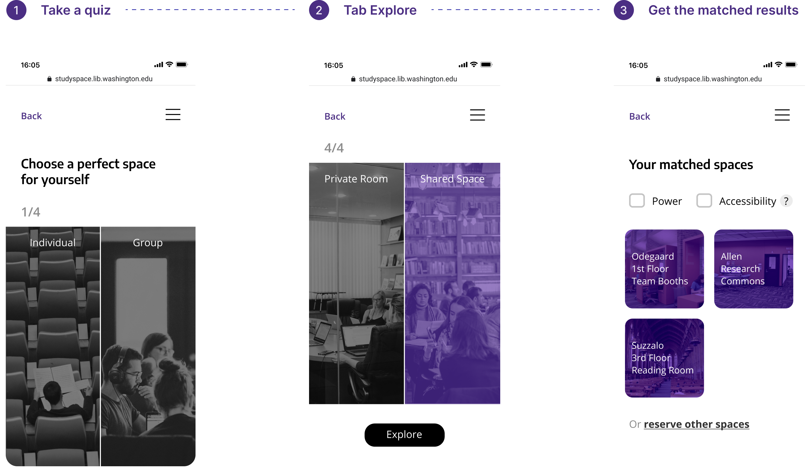
❌ Students don’t find study spaces match their needs
Design Approach
Users can choose the environment or the type of study space that they prefer and get the result that matches their needs.
❇️ Take a quick quiz to find a matched space
Users can choose the environment or the type of study space that they prefer and get the result that matches their needs.
User Pain Point 2
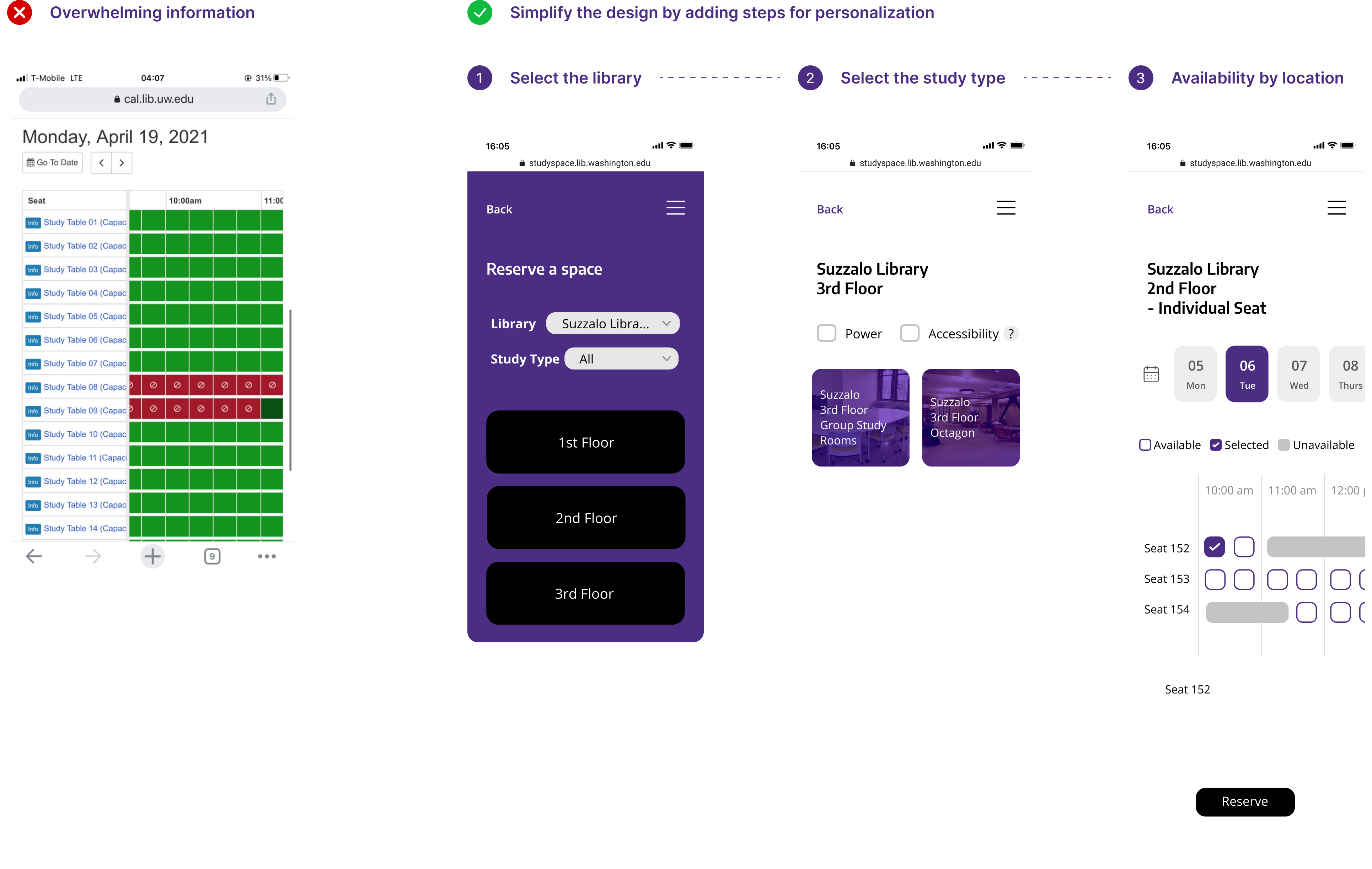
❌ Students are unaware that they can reserve a space via mobile or finds it difficult to do
Design Approach
Have a dedicated “studyspace” page that can be easily accessed from the library home page, where students can see availability and reserve the study spaces within fewer taps.
❇️ A more-mobile friendly “studyspace” page that shows availability and allows users to reserve a space
Have a dedicated “studyspace” page that can be easily accessed from the library home page, where students can see availability and reserve the study spaces within fewer taps.
User Pain Point 3
❌ Students don’t feel comfortable using the space
Design Approach
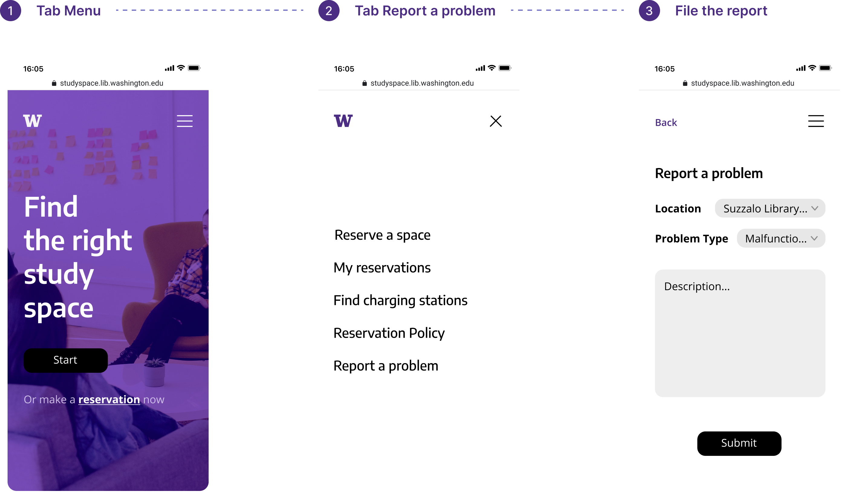
❇️ Report issue
The current UW Library website actually has an option to report an issue, but I found from the research that most students are unaware of it. Having its own page for “studyspace” will bring more visibility to the report issue option and allow the students who may experience issues related to study spaces to report it at ease.
Usability Testing
I tested the prototype with 4 students—two participants had experience reserving study spaces on UW website while the other two never reserved study spaces online.
🧍 Getting the real users to test the prototype
I tested the prototype with 4 students—two participants had experience reserving study spaces on UW website while the other two never reserved study spaces online.
“
“The UI looks clean but it’s a bit unclear of what I should do for the space-matching quiz.”
“I never wanted to visit the library website on my phone, but I found this version much more simple and easier to navigate.”
“There could be an option to reserve a space based on my availability.”
”
Iteration 1
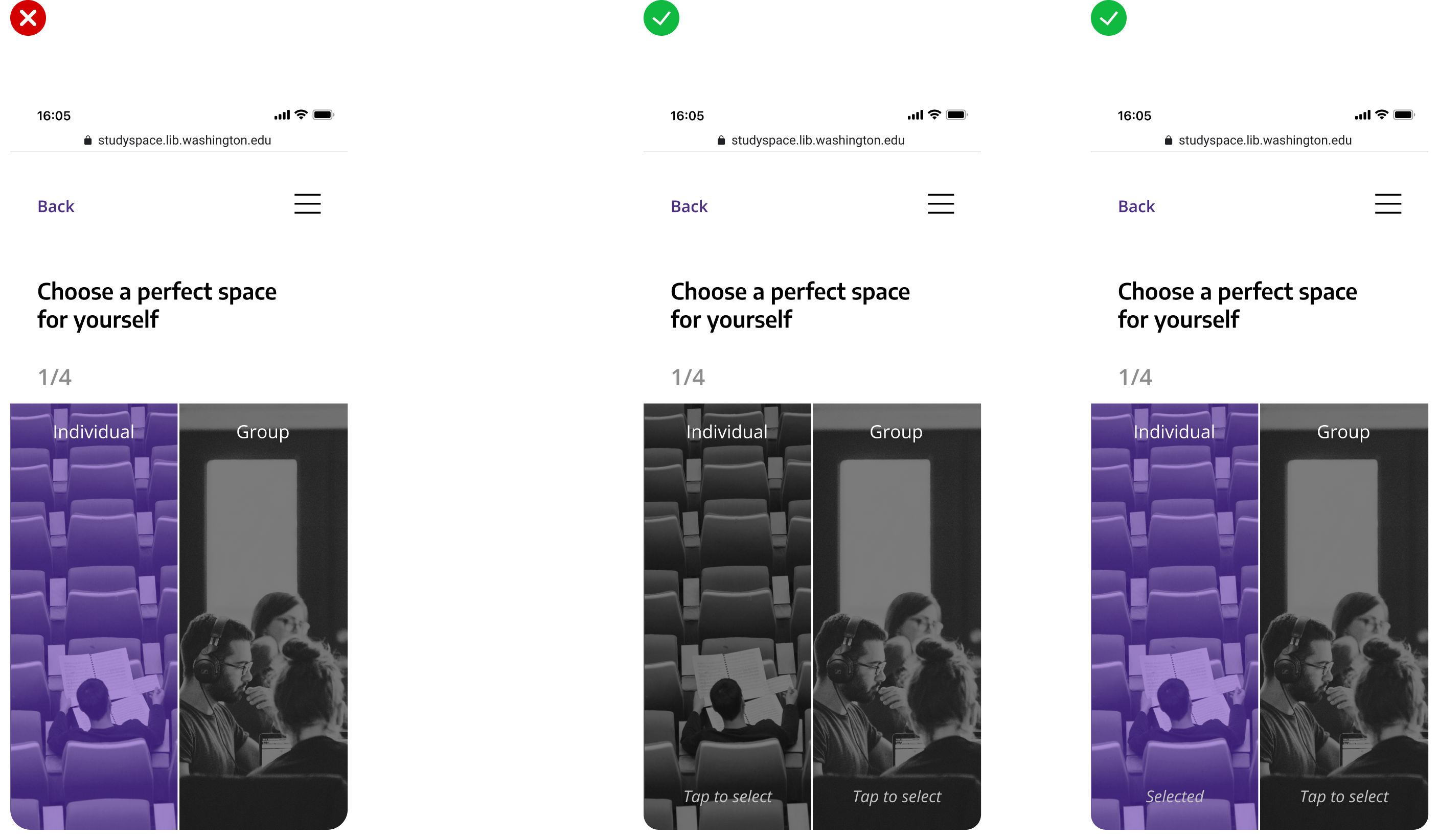
By providing clear cues for selection and confirming user choices, this iteration aimed to improve the overall user experience, making it more intuitive and user-friendly.
Add a signifier and feedback — “Tap to select” and “Selected”
By providing clear cues for selection and confirming user choices, this iteration aimed to improve the overall user experience, making it more intuitive and user-friendly.
Iteration 2
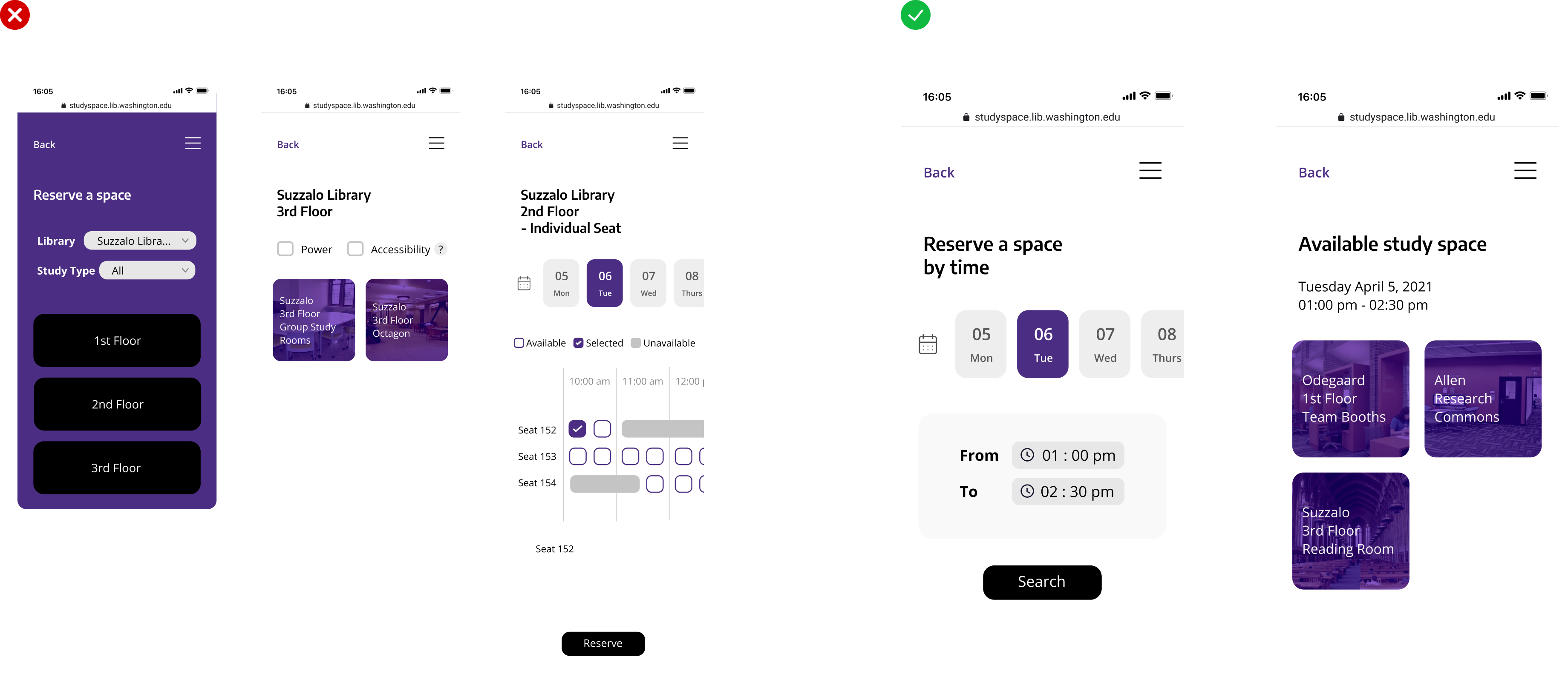
This iteration would enhance user convenience and support users’ scheduling preferences, aiming to improve the usability and relevance of the reservation system.
Include a more personalized option— reservation by time
This iteration would enhance user convenience and support users’ scheduling preferences, aiming to improve the usability and relevance of the reservation system.
Impact
I conducted another usability test with two groups of participants, having one group (n = 10) test the original reservation system and the other group (n = 10) test my new design, then completing the System Usability Scale (SUS) questionnaires. The results show a 28% increase the SUS score.
28%
increase in SUS score 🎯
I conducted another usability test with two groups of participants, having one group (n = 10) test the original reservation system and the other group (n = 10) test my new design, then completing the System Usability Scale (SUS) questionnaires. The results show a 28% increase the SUS score.
⏩ What I would do more or do differently
- Gather data on user behavior when reserving study spaces, their preferences, and their demographics to ensure the specified issues and tailored solutions.
- Collaborate with a cross-functional team to iteratively design and develop a more user-friendly, intuitive, and personalized study space reservation solution.
- Continuously gather user feedback for the iterative process.
✍️ Lessons Learned
⌛️ A good design and research strategy is the key when working under time constraints
Having a robust plan for this project allows me to stay focused, organized, and on track. To meet the tight deadline, I prioritized desk research and initiated the design phase early, leaving more time for iterative improvements.
✨ Clear affordances are vital to usability
Making design elements intuitively understandable for users is important. Even a small part of the UI can cause confusion and frustration, so having clear affordances make it much easier to interact with the system.
